Cross-product Data Integration UX Research and Design
Overview
My role: UX Researcher/UX Designer
Goal: Discover ways to integrate new capabilities of bulk extract into existing desktop-based product suite, primarily with data from the Illume Courses product.
Users: College and university academic advisors, success coaches, administrators, and students
Techniques used:
In-person interviews with our internal subject matter experts
Creating mockups and prototypes with Sketch and InVision
Presenting a slide deck with my findings to the internal stakeholders
Challenges:
Required in-depth knowledge of product I was unfamiliar with
Limited number of interviewees
Product Deep Dive
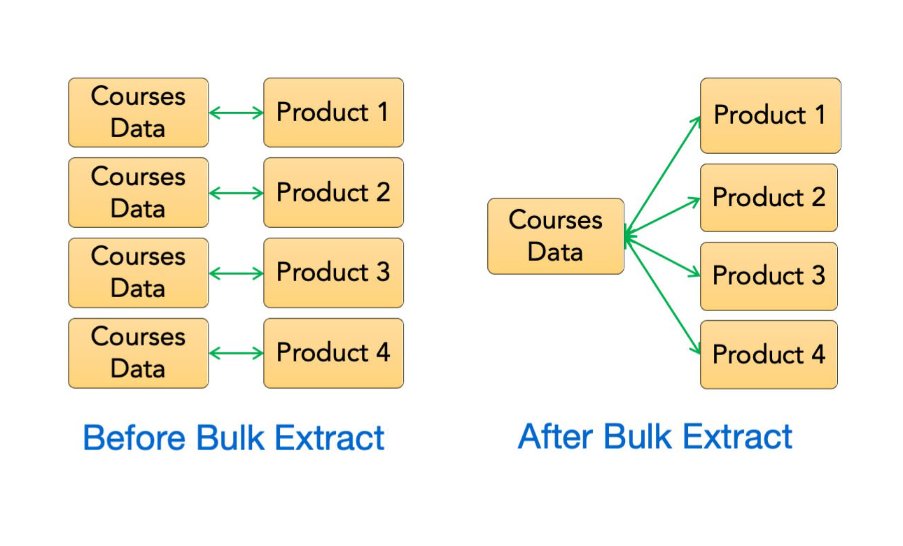
This research and design project stemmed from a new technological capability that our development team had been working on for a few months. Previously, our products containing a high quantity of data analytics could send that data to only one source at a time, which was time-consuming and inefficient. Now, we were able to send the data one time, and have it surface in multiple places at once. This process was called "bulk extract". I was tasked with finding the best uses of this capability within our product suite, which was centered around increasing persistence and graduation rates for higher education students.
I consulted with several in-house subject matter experts to better understand the Illume Courses product, which was rich with user data, and learn how its insights could enhance our other products, both technically and conceptually. Our target audience for this application was college academic advisors and students who might use the data-informed course success indicators to assist in planning their degrees and course selections.
To do this I worked with colleagues across several departments, including software engineers, product managers, the VP of Product & Strategy, the Director of Strategic Planning and two product consultants who had direct client contact, and another UX Designer on my team.
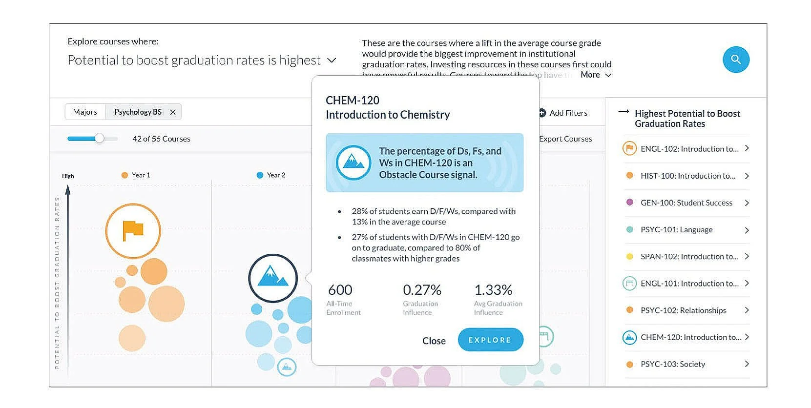
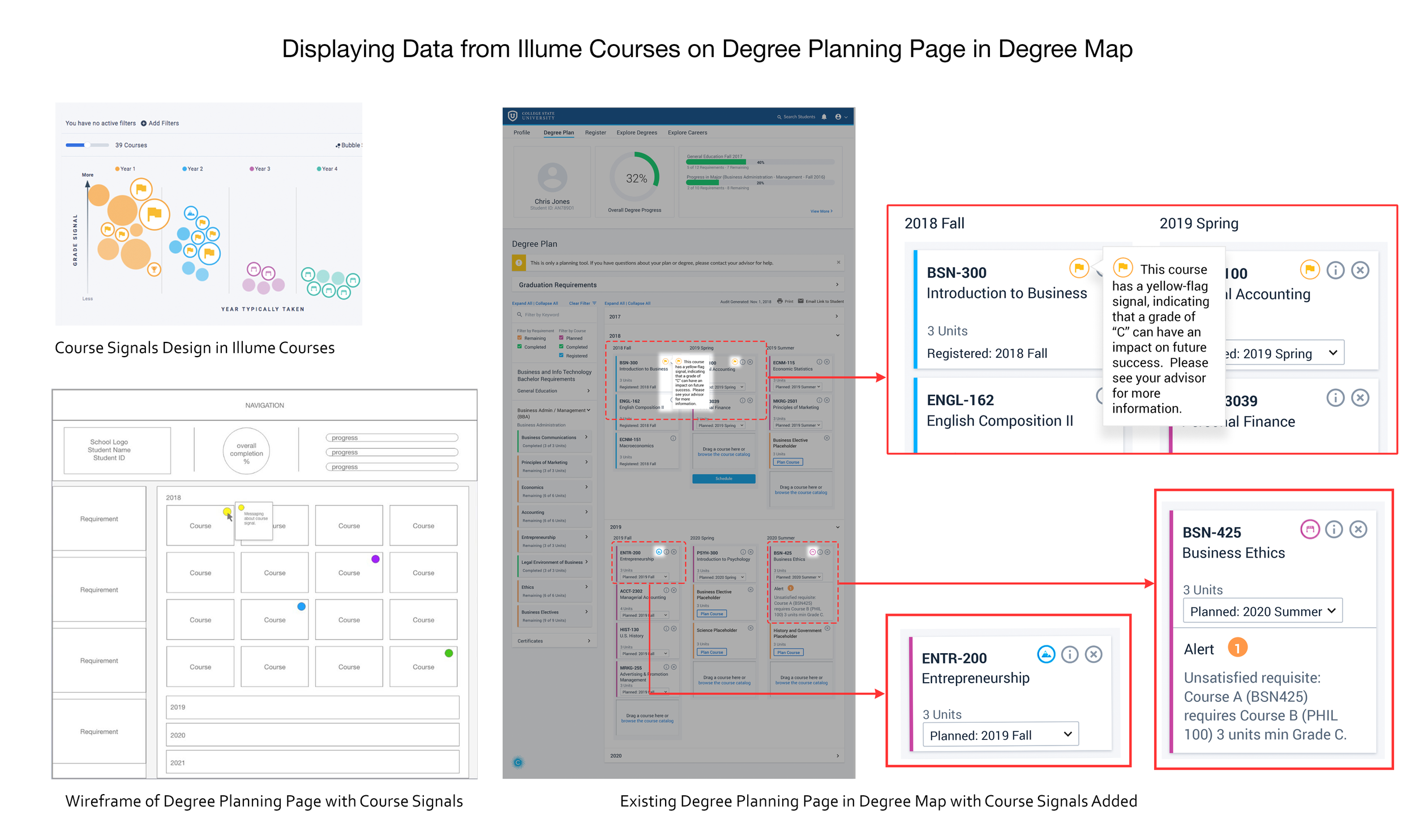
The primary way the data in this product was surfaced was with a "course signal". These were graphical indicators of the student success data. These signals were "Yellow Flag", "Qualifier", "Challenge", and "Late Hurdle". They were based on a combination of grades and persistence rates of the average student taking a particular course. I determined through my research that these visual cues would be the most efficient way to communicate the data to our users.
Interpreting the Data
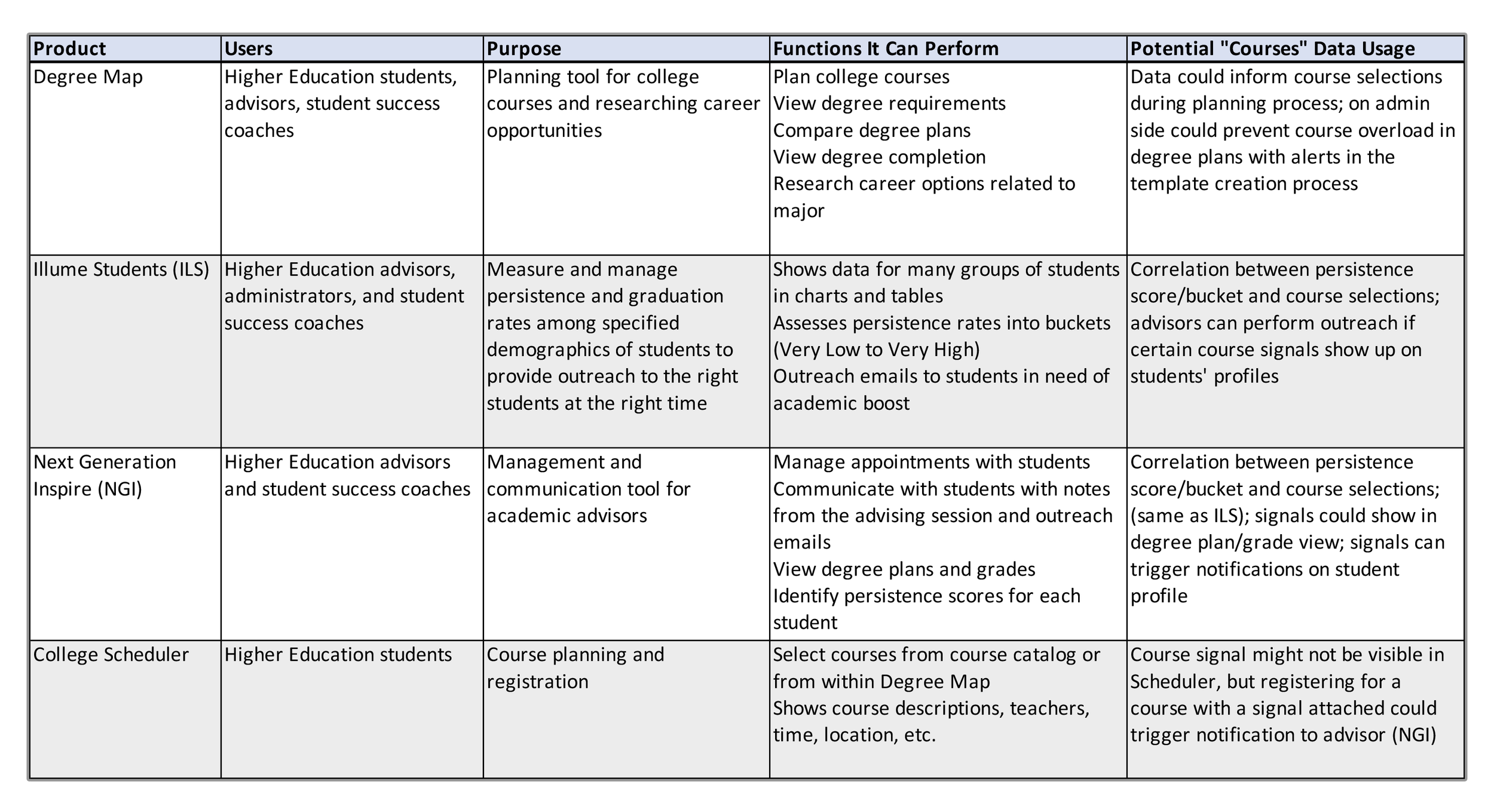
After many conversations about how Courses worked, who it served, and what types of information it contained, I evaluated the other products we sold, and identified ways in which the data could enhance their usage.
Ideation and Concepting
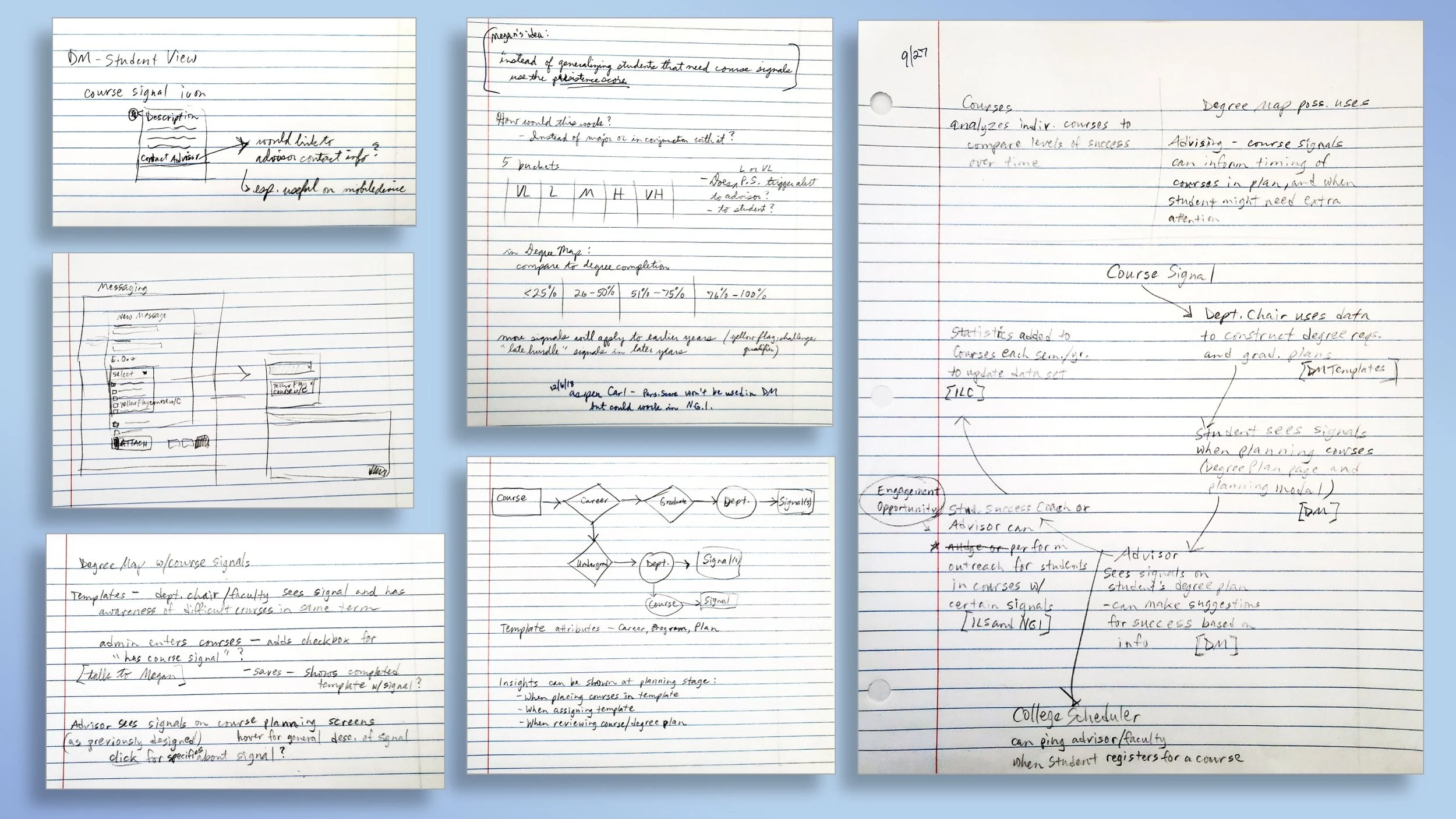
As part of the design process, I sketched out a few concepts of how the data from Courses could be surfaced in our other products.
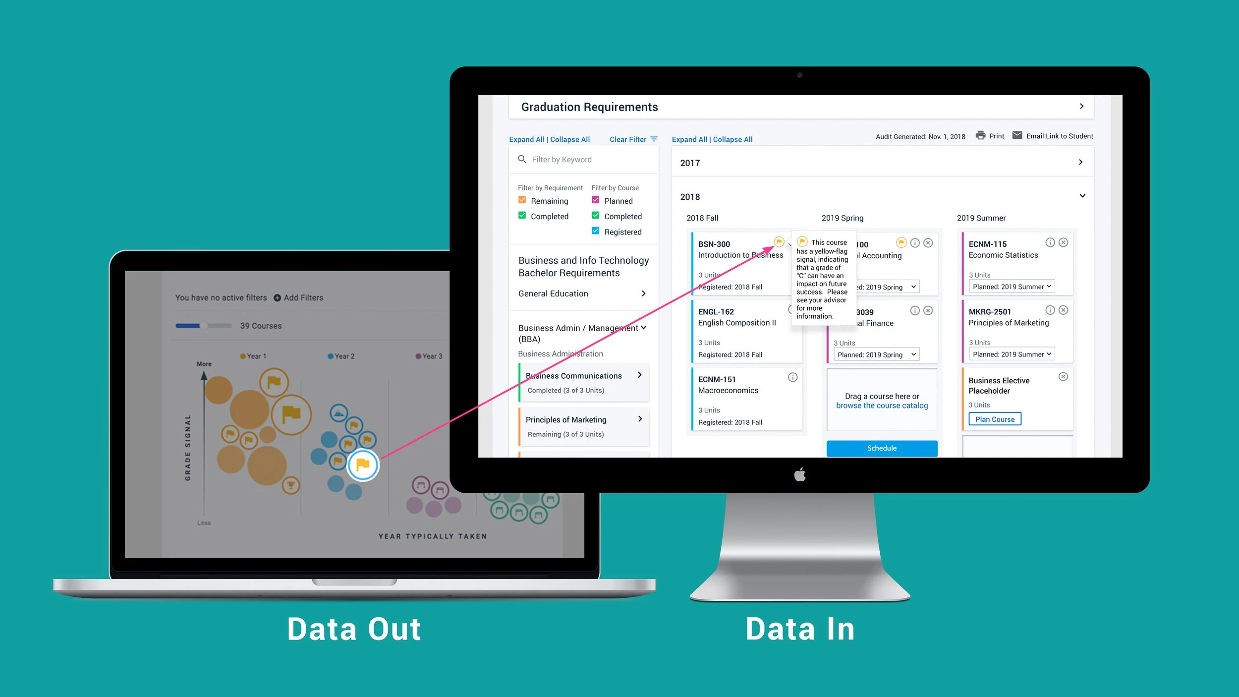
As I gained a more thorough understanding of what type of data Courses contained, and how it impacted student success, I was able to develop a concept (shown below) of a flow of data-driven course signals throughout our product suite.
Testing and Interviews
Two of our product consultants had been college academic advisors prior to their roles at Civitas, so they had first-hand knowledge of the impact this information could have and how it could be implemented. I showed them the initial sketches I’d produced to illustrate my concept, and we discussed where improvements could be made and if my concepts were feasible in practice. Some notes from our conversation were as follows:
Refinement and Presentation
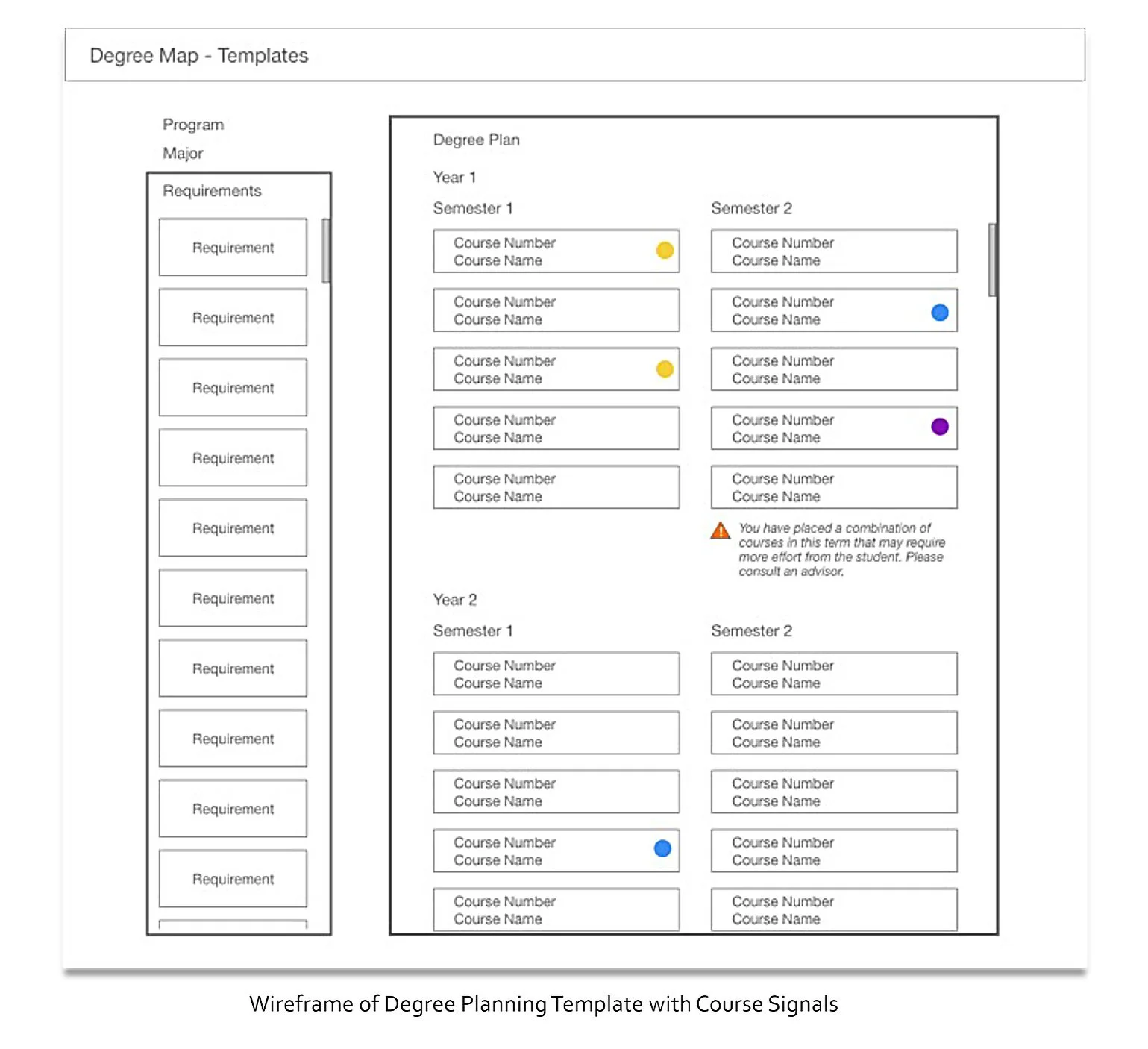
This is an example of how the data from Courses could be surfaced in Degree Map (the degree planning product). My main deliverable for this project was a full-color prototype featuring this concept as well as one from the administrative side of planning the degree requirements; however, it is not available for use outside the company. I presented the prototype to the VP of Product & Strategy, first for initial feedback and then again when I had refined the work. With her approval, I presented the prototype and a slide deck to the project manager for the Degree Map product for final review.
Insights
My soft skills in relationship building and empathy were crucial assets in the initial discovery phase of this project.
Data would need to be scaled down from the content available in Courses to a more manageable data set for the other products.
Course signals should only be shown on advisor views, not student-facing, to prevent misinterpretation of the insights.
There would need to be additional work to determine how the data analytics would pair with the hundreds of course options available.
If given the opportunity to revisit this project, I would do more interviews with current students and advisors to gauge the viability of these features.
Ultimately, the company went in a different direction with Degree Map, so these solutions will probably not be implemented in that product; however, there is potential for use with the company’s advising tools.
