Medical Appointment Transcription with Med Notes App
Overview
This self-directed UX Design project is my response to the experiences of several of my friends who have loved ones with chronic and complex illnesses, requiring the attention of multiple specialists. I wanted to provide help in both learning about the diagnosis and retaining accurate instructions after a stressful medical appointment.
Research
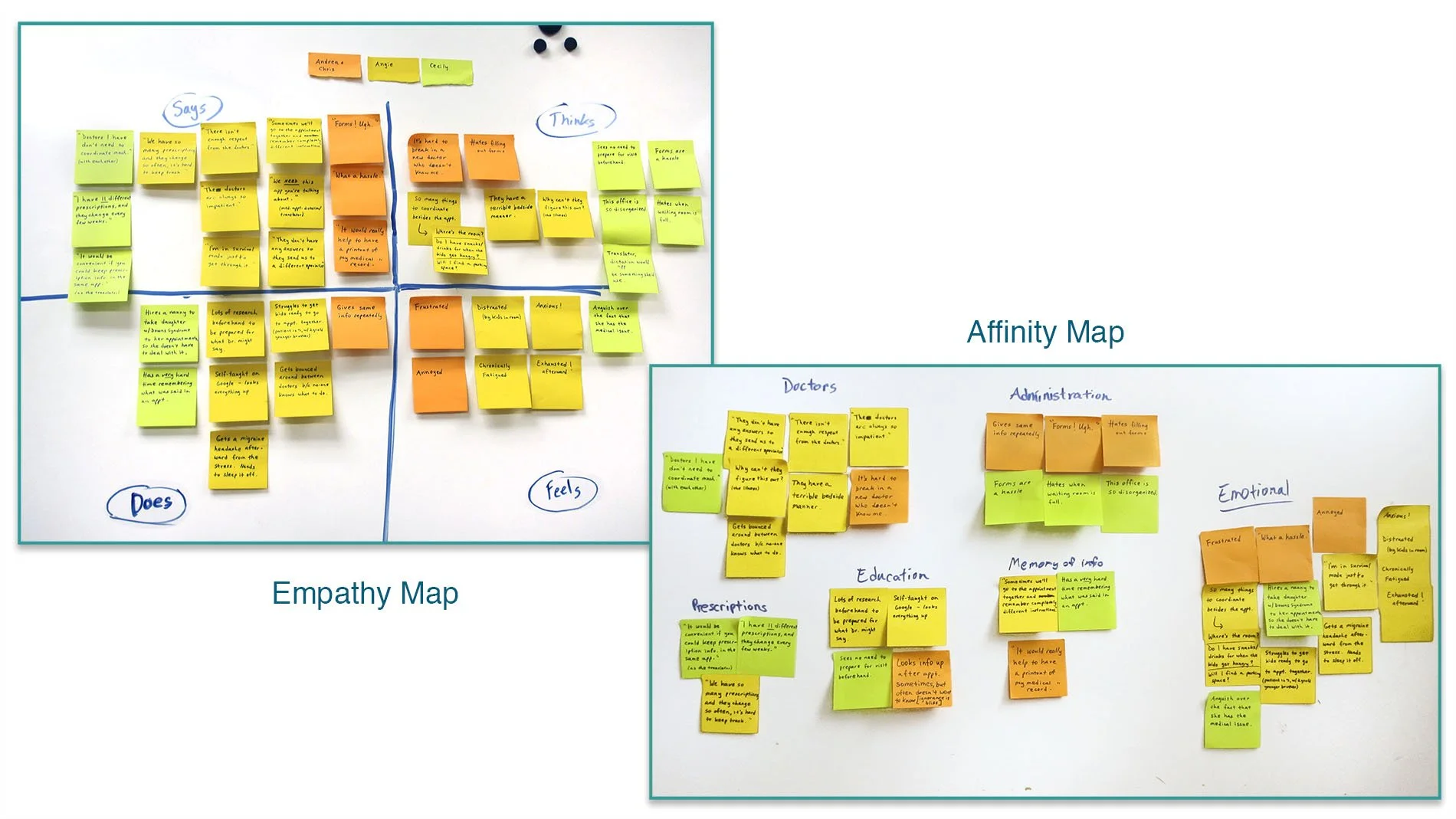
To gain an understanding of common pain points in medical care, I interviewed 4 caregivers/patients through conversations in person, plus one subject via questionnaire. I also spoke on the phone and via email with 2 nurses, and 3 medical facilities regarding usage of recording devices during appointments. After the interviews, I converted my notes into post-its and sorted them first into an empathy map, and then later into an affinity map to get a clear sense of where the pain points were and what the best possible solutions would be.
Understanding the User
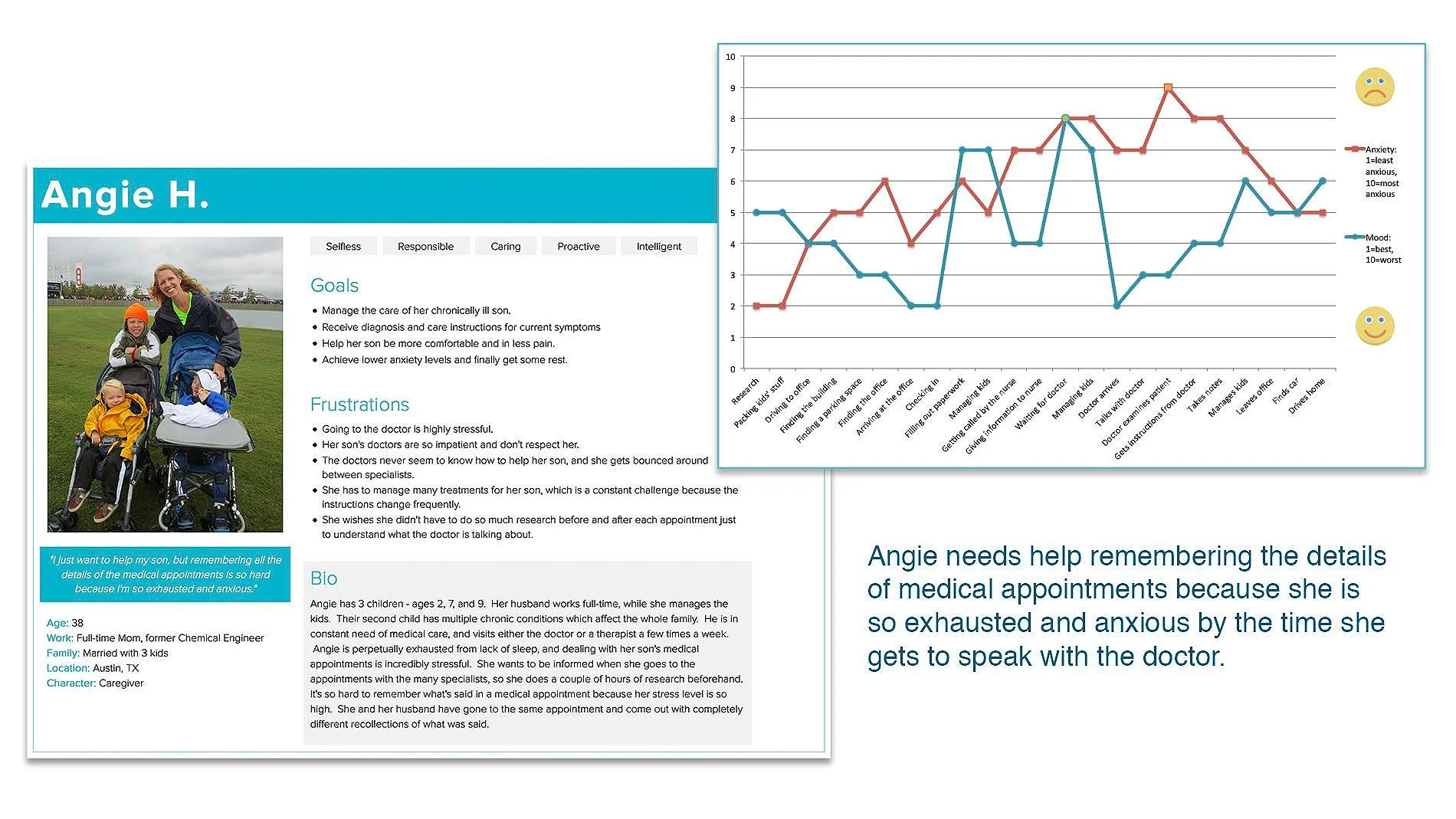
Angie is one of the people I interviewed, and the persona and journey map shown here are derived from the notes from my conversation with her.
Data Synthesis and Ideation
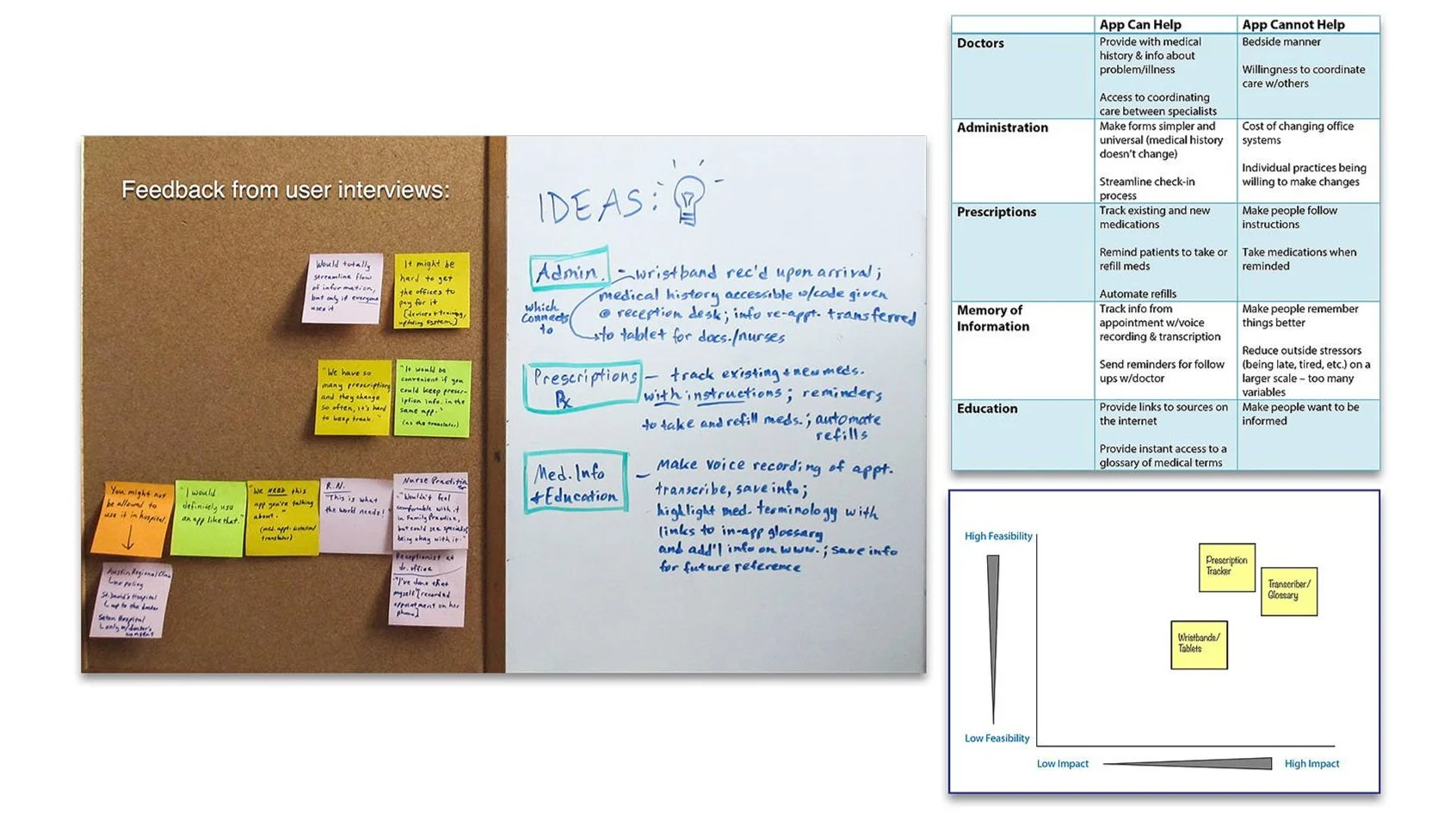
Top three app concepts
Wristband/Tablet system: Pros - very convenient and would make a difference to the patients | Cons - too hard to standardize, and not controlled by the patients
Prescription tracker: Pros - extremely useful to patients | Cons - very common apps right now
Transcriber/Glossary: Pros - would make the most impact, most innovative because there are apps that do these individual tasks, but not that combine them all into one | Cons - highly time consuming to develop, need doctor consent
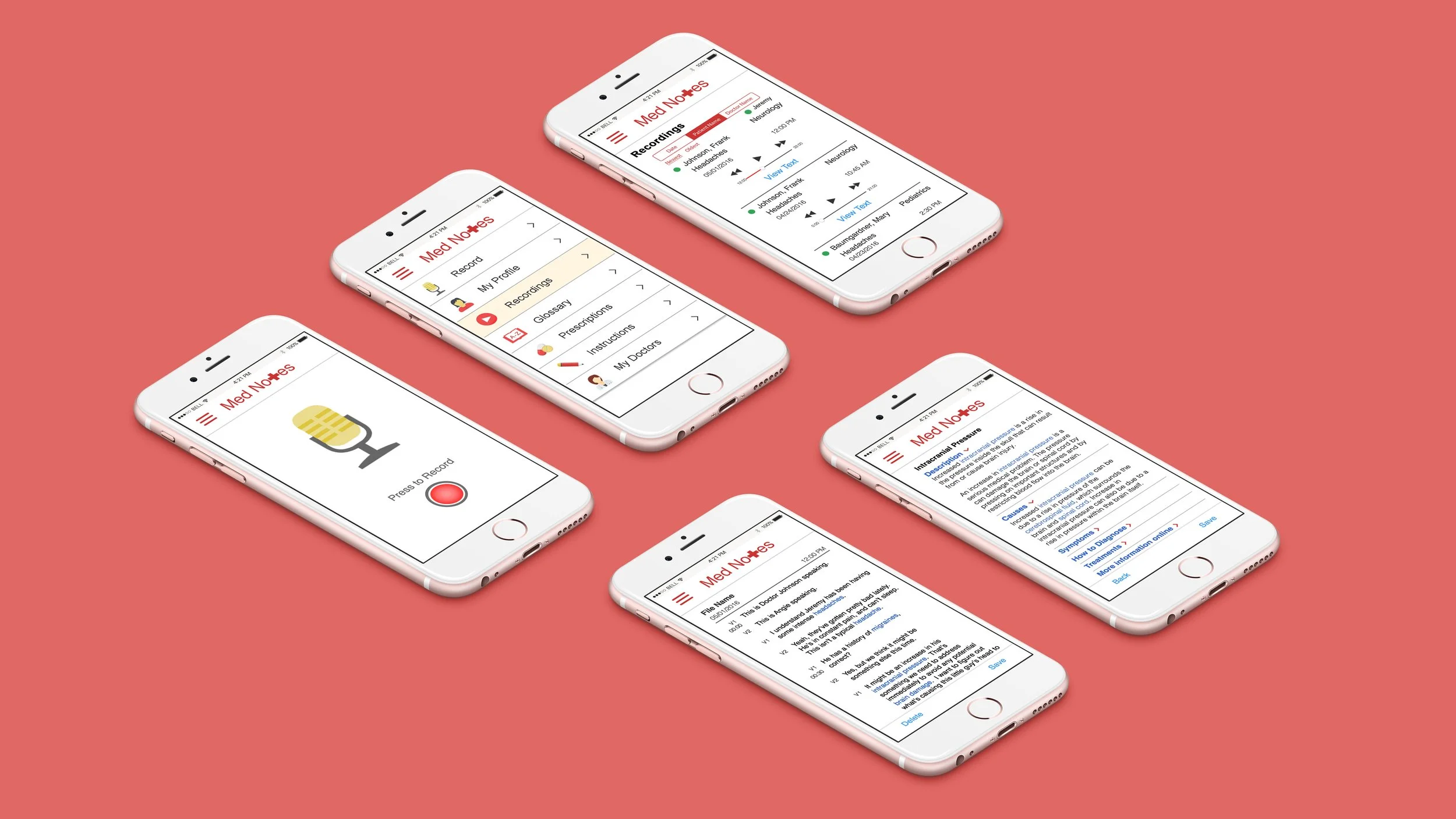
Because I wanted Angie to be able to keep all her medical information in one place, and be in control of that process, I ended up choosing the transcriber/glossary app, and planned to include features to track prescriptions, doctor contact information, instructions for care, and sharing of medical definitions.
Sketches and Wireframes
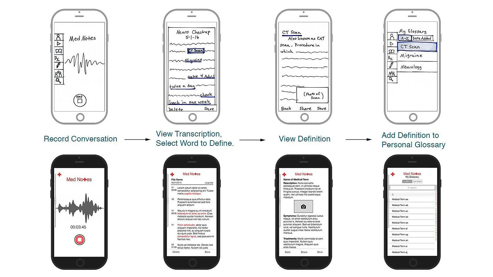
Once I had settled on a path forward, I sketched concepts and converted those into wireframes using Adobe Photoshop. These were eventually fleshed out into a hi-fidelity prototype made with InVision.
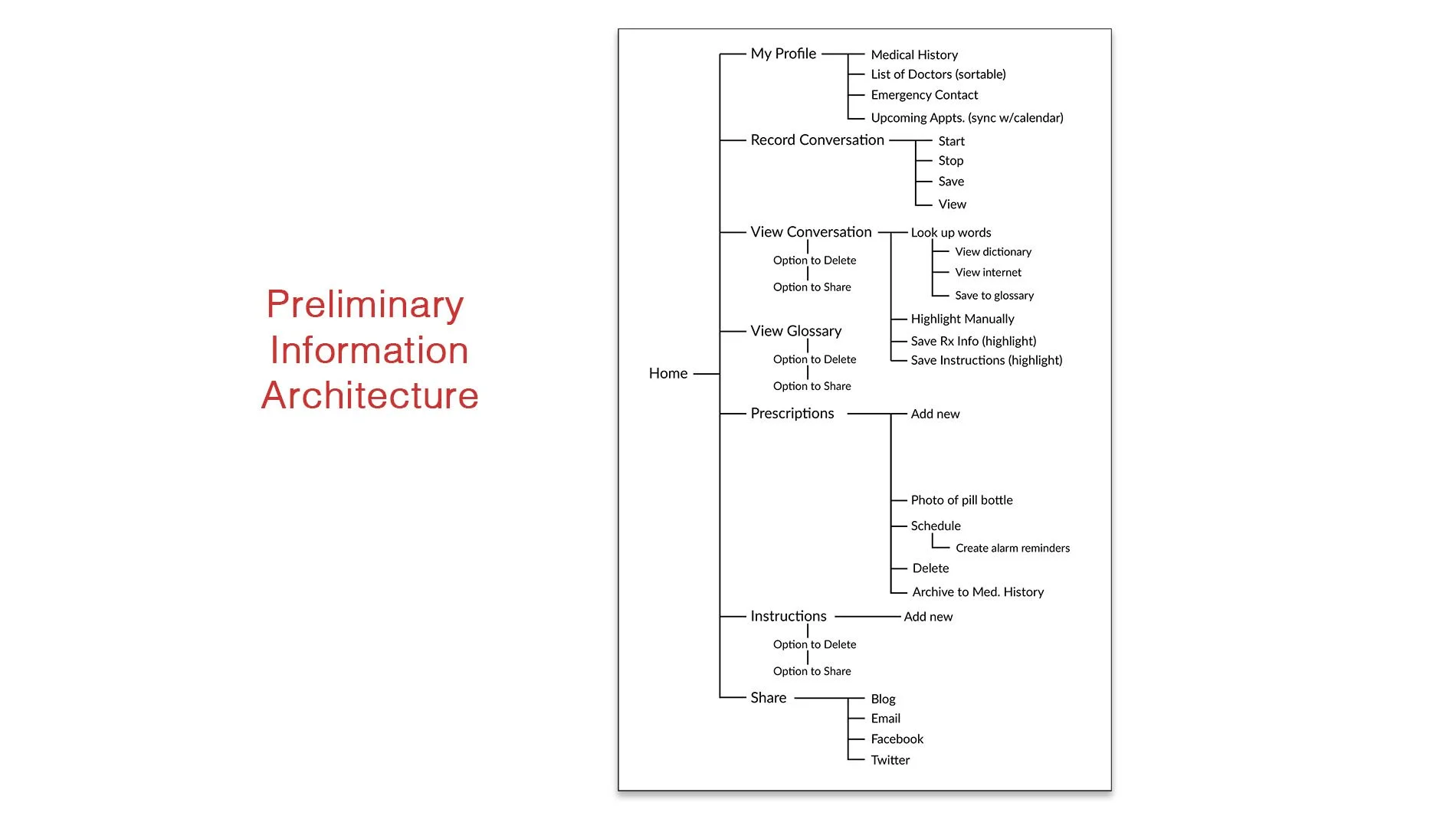
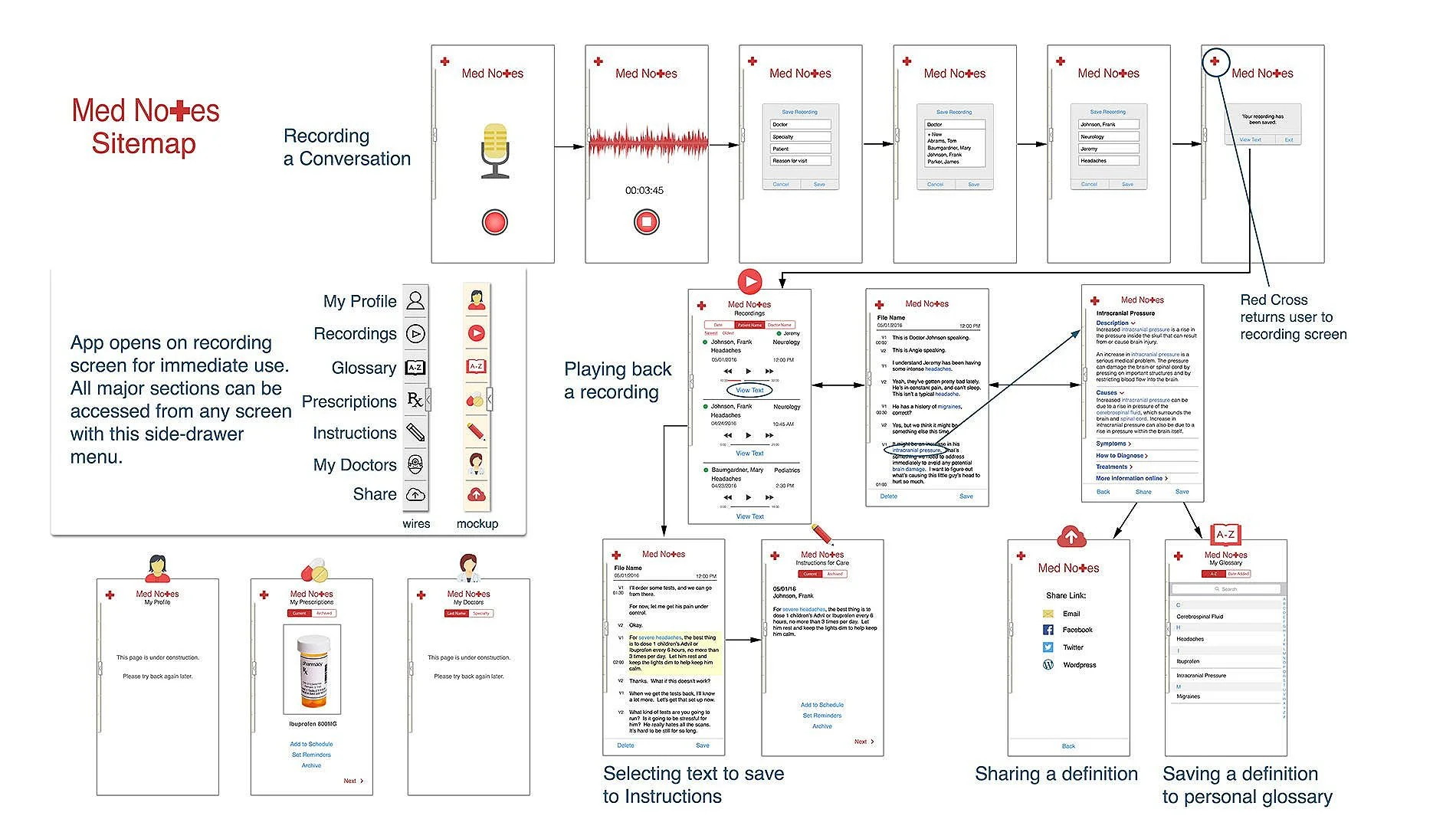
Architecture and User Flows
See below for diagrams of the preliminary information architecture and high-fidelity sitemap for Med Notes:
Visual Design
Edits made during mockup design included:
Adding full-color icons
Creating a full scenario of text that would continue through the whole prototype
Tightening alignment and spacing throughout
Changing the tab headings on the "Recordings" screen for more user-friendly sorting
Changing the layout of the "Definitions" screen based on the quantity of content I added
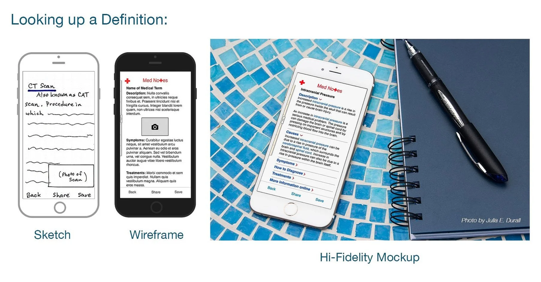
One of the biggest challenges in this project was creating the text content for each screen. In the case of the “Definitions” screen, I referenced WebMD for detailed information about the medical condition I chose. What I discovered was that there was so much information available that I needed to adjust my screen interface to accommodate it.
I didn’t want the user to experience an “infinite scroll”, so I chose to use an accordion pattern to consolidate the content, shown in this photo I shot to show what it would look like when Angie is using the app.
Usability Testing
I was able to do in-person user testing on my phone shortly after completing the hi-fidelity prototype. With the InVision prototype on my iPhone, I was able to walk users through a scenario that would let them experience the entire app. I got a lot of positive feedback about the idea itself and also the quality of the prototype.
There were questions that came up that gave me some additional insight, as well, such as whether or not it was HIPAA compliant for doctor/patient privacy. This led me to think that it might be prudent to remove the sharing feature or alter it so that the transcriptions of the appointments could not be shared, but the other areas could.
My friend Angie, who was one of the people who inspired the project, tested the finished prototype and had this to say:
Hi Julie,
It's a really impressive app! There are a lot of helpful features, and it is easy to use and understand. I would love to try it out for real at an appointment!
Angie
Needless to say, I was very happy to hear her response, and it made me feel as though the whole project was worthwhile.
Revisions
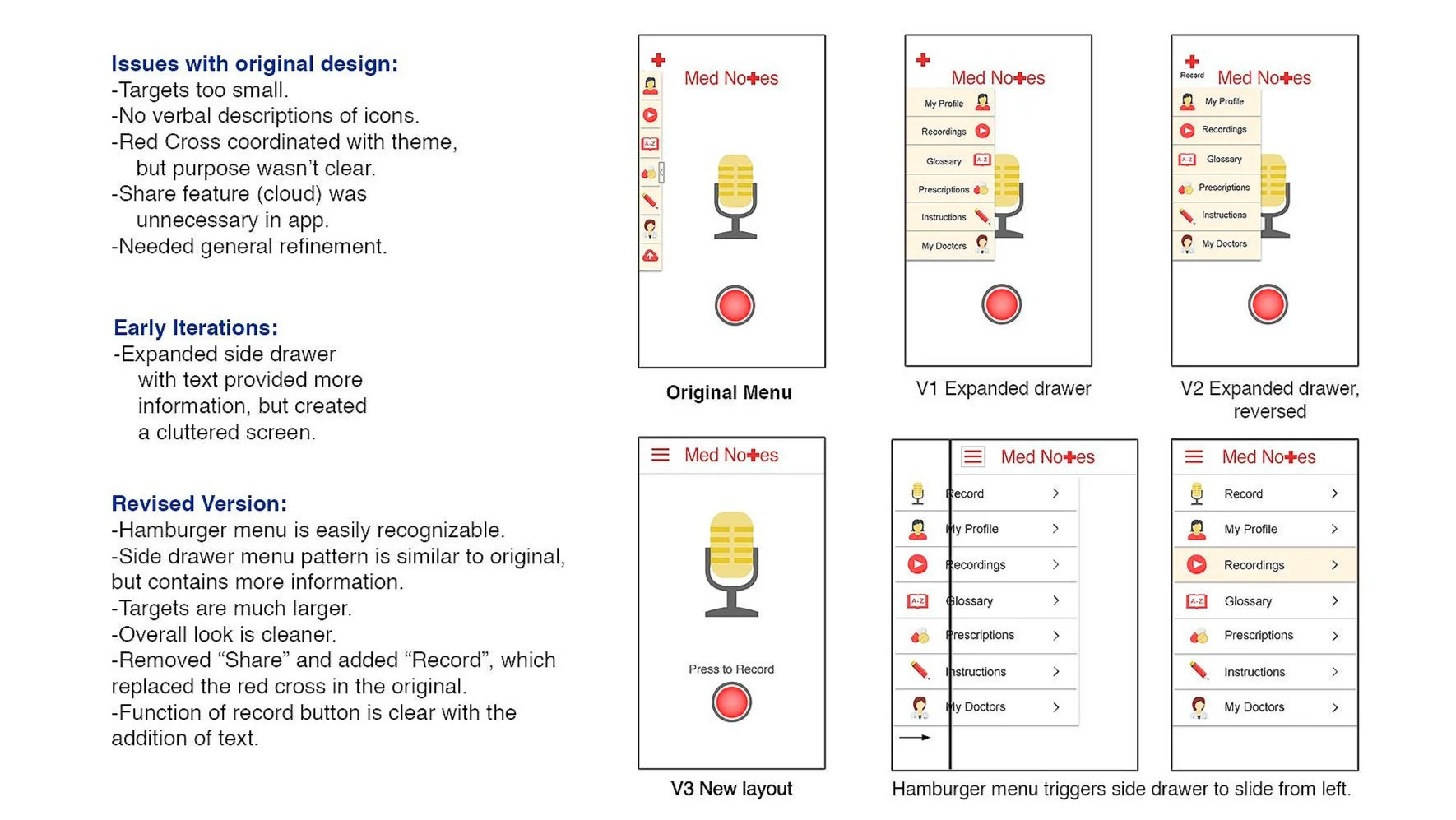
Over the course of the next several months, I presented this project many times, and received additional feedback and questions regarding the design of the menu and if all the features were necessary. I took it upon myself to refine my original prototype.
