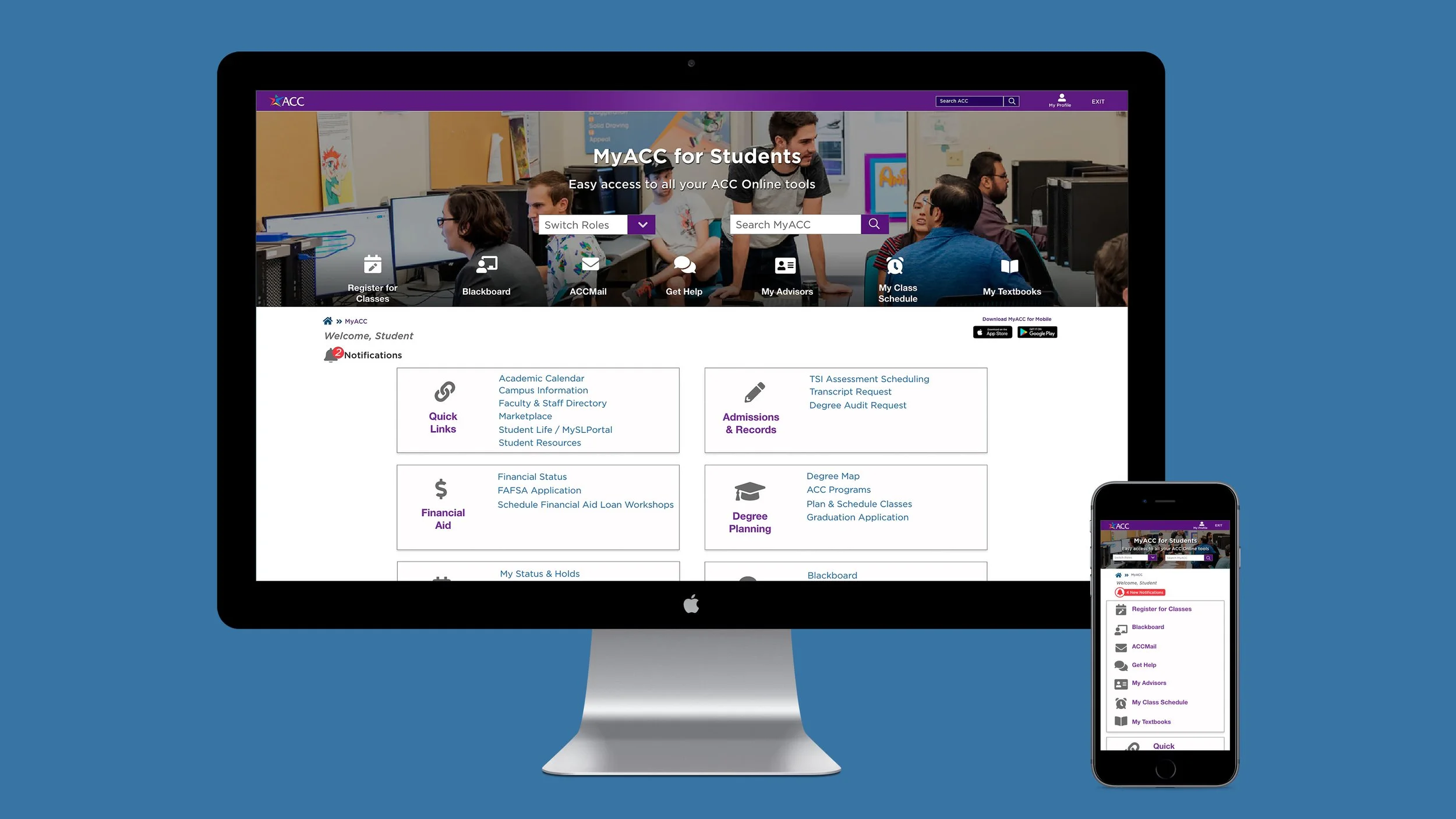
Modernizing UI and Information Architecture of MyACC portal
Overview
My role: Lead UI/UX Designer within the IT Department on a cross-functional team spanning 3 departments
Primary stakeholders: V.P. of IT, V.P. of Marketing, College Provost, Web Applications Mgr., Student Affairs Director
Users: The portal would be used primarily by ACC students, but also by faculty and staff. ACC currently has over 70,000 students enrolled, including dual-enrollment high school students.
Challenges: Poor communication between teams and a tight deadline of 2 months
Visual Design Refresh
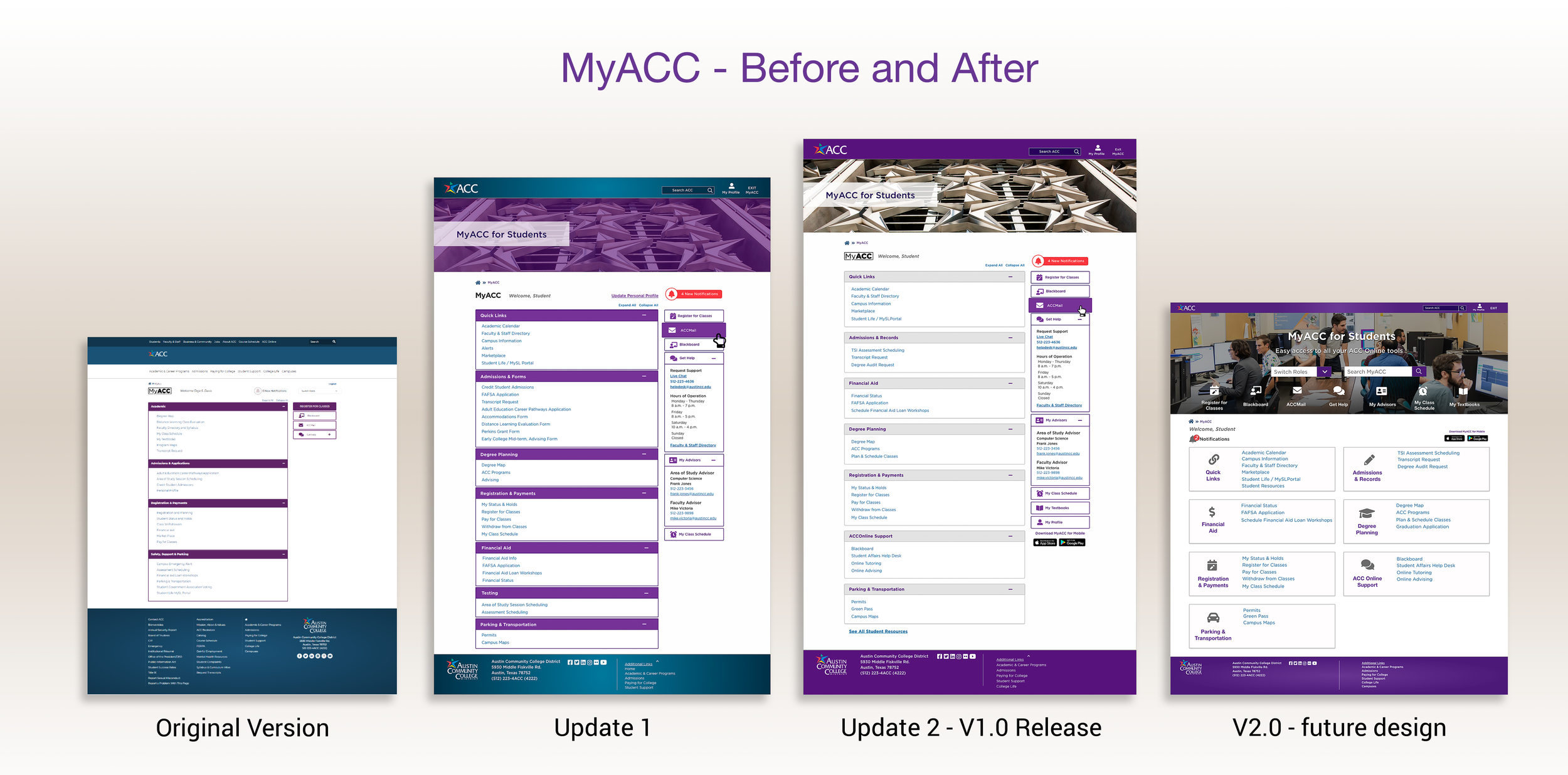
The original design of the MyACC portal started with a landing page which the team ultimately decided to not use. The shade of purple on the category bars was inconsistent with both the school's primary color and the shade used on the landing page. The design also lacked visual interest and had an excess amount of information in the header and footer sections.
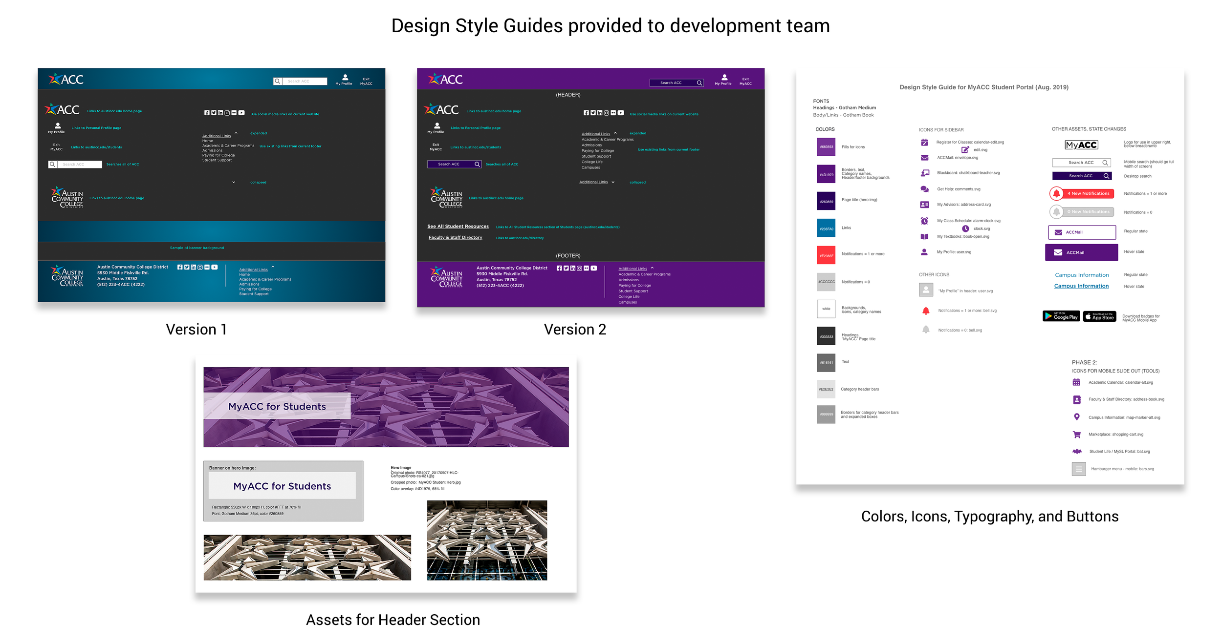
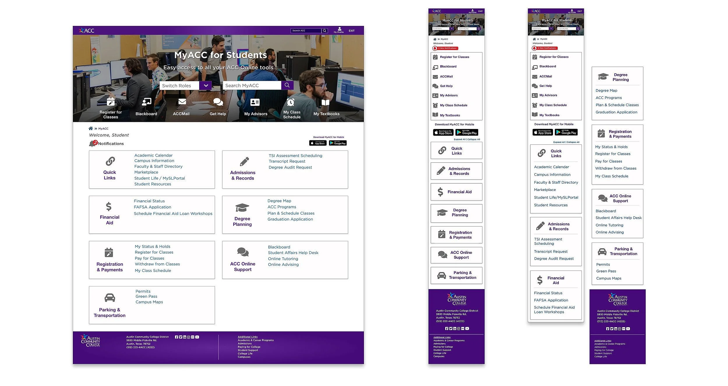
The main areas of interest regarding the new look and feel were to update the shade of purple to coordinate with the new color Marketing was going to be using for the external-facing ACC website. The team decided that since the users would have to already be registered and have an EID before accessing this portal, we didn't need all the same information as the main website. We were also going to use a stripped-down header and footer and make sure there were also links to the companion MyACC mobile app being launched at the same time as the portal. I created both desktop and mobile layouts, as well as a style guide for our development team.
Visual Design Iterations
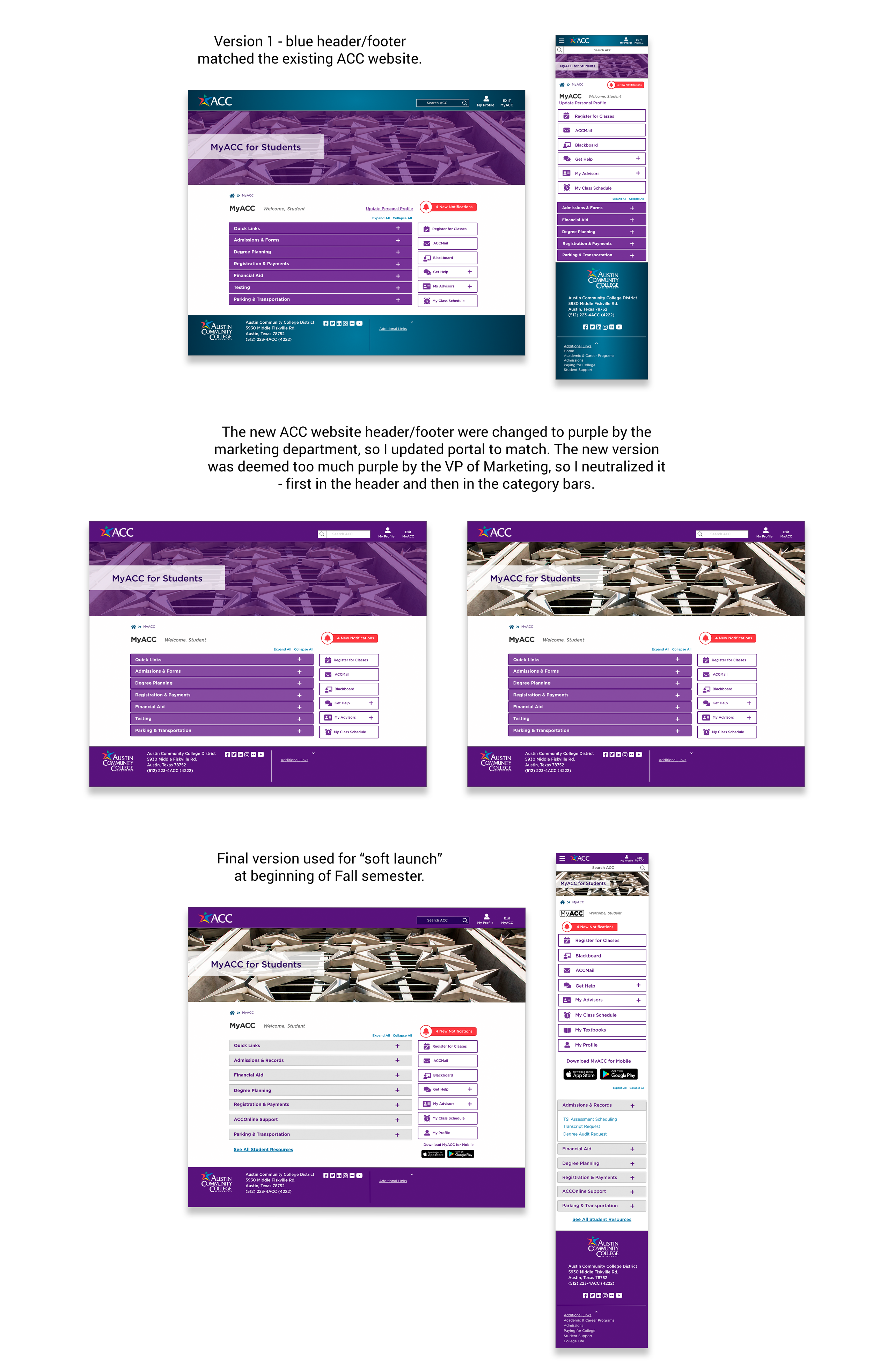
Initially, the color palette of this design coordinated with the external-facing ACC website, which had the same blue header and footer. However, during the course of the project, it became clear that the color scheme of that website would be changing soon to have purple instead of blue. I updated my design accordingly, but then was met with resistance from the VP of Marketing. She felt that the addition of the purple header and footer resulted in too much purple on the page. The web manager and I both agreed, so we worked together to quickly neutralize the colors of the body, first with the header image and then adding changes in the category bars. This became the version we used in the "soft launch" at the start of the new semester.
Testing and Revisions
About a week after the "soft launch", we received data from a survey that our initial users completed. We received mixed feedback, some of which was hard to interpret because the survey referred to both the desktop app and the mobile app, which were completely separate designs and functionality. There were a handful of changes that we all agreed would be improvements that were easy to achieve, such as shortening the height of the header section, having the links in the footer default to open, and relocating the "All Student Resources" link to the top section of "Quick Links". These changes and others were put into the development backlog for a subsequent sprint.
MyACC, Version 2.0
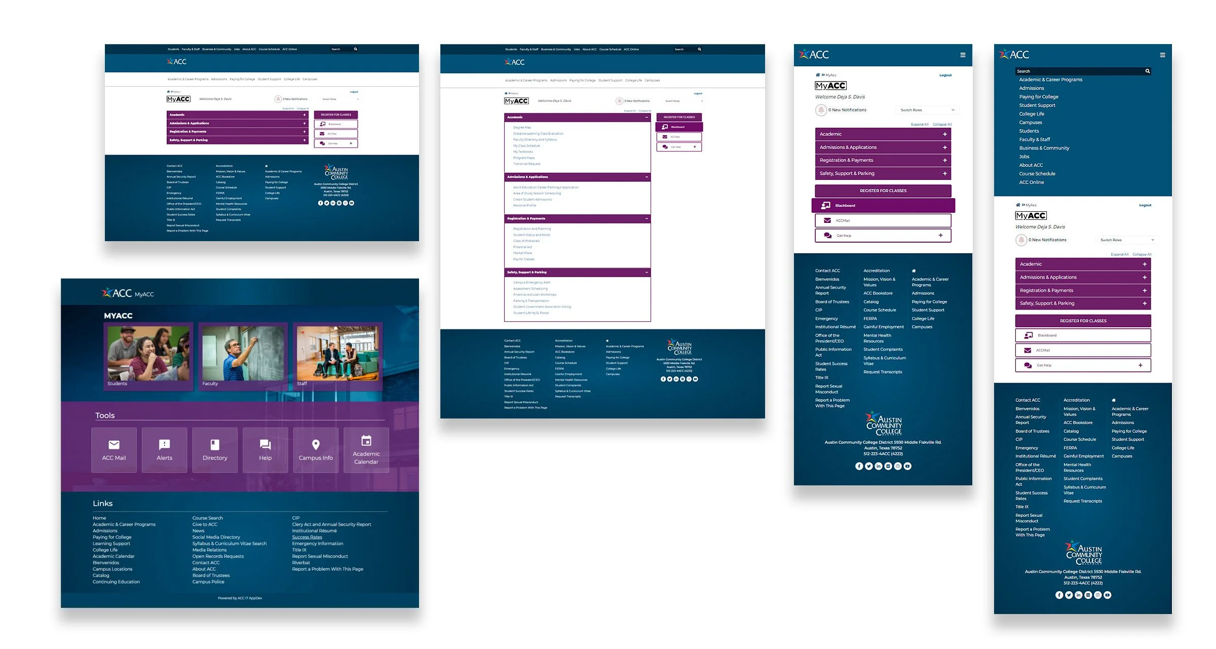
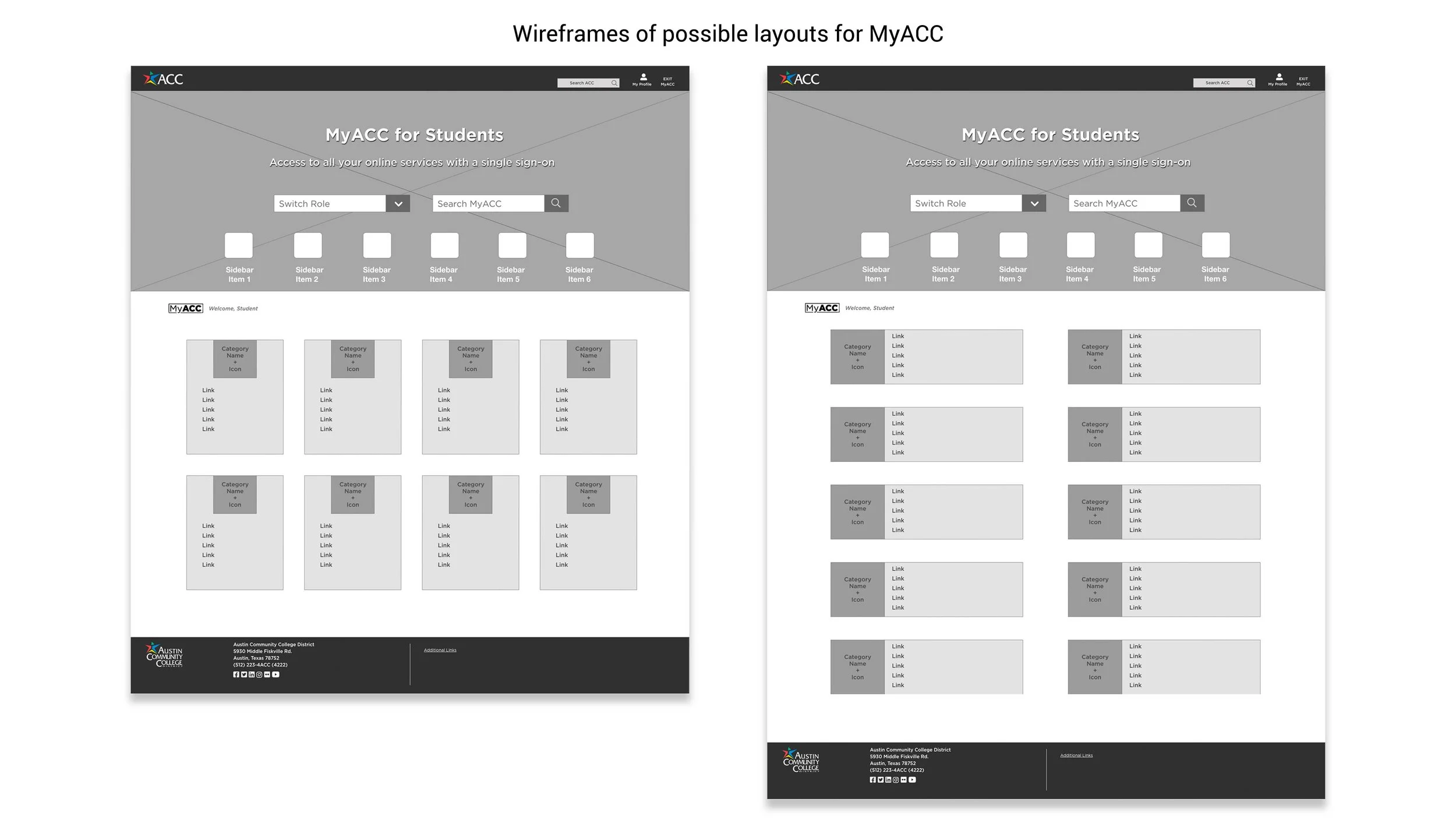
I had done some preliminary research regarding the visual design, and had a style in mind for a new layout for the portal. After presenting wireframes of new layouts to the group, I received positive feedback, with a question about functionality from the front-end developer which helped me refine the concept. Unfortunately, because I was brought into the project so late, there wasn't enough development time for a completely new design. The project manager and development manager agreed that we would just update the look and feel for now, keeping the structure the same.
While version 1.0 was in development, I continued to polish the next iteration of the design, which was a fleshed-out version of the wireframes I had initially presented. I preferred this layout because it not only added visual interest with the addition of cards and icons, but also reduced the amount of wasted space above the fold and didn't require as much effort to locate the links since they were all visible from the start. This would enable students to access their online services more quickly and intuitively. This version is currently on hold, pending further testing of the current one.
Project Summary
Insights
This project was an exercise in teamwork and flexibility. Once we were all on the same page as a team, it didn't take long to get the new portal design across the finish line. I was later commended for bringing everyone together in such a productive way.
I feel that more testing should have been done before launching the updates, but students were not available at the start of a new semester to participate.
Ideally, I would have put version 2.0 into production from the outset, rather than limit the updates to a color and navigation refresh. Had I been brought in earlier, there may have been time for the full redesign I had envisioned.
Challenges
This project was full of challenging moments, much of which stemmed from communication issues between departments and with the third-party development team. The lack of clear communication and direction created a tight timeline, which was stressful for all involved.
Also, the heads of Marketing and IT were both territorial and in constant opposition, so I acted as a liaison between these two departments because the only way to get this project launched was to have buy-in from all sides. I was later commended for successfully building that bridge.
